9 Mobile Branding Mistakes Quietly Killing Your Growth
If you are building a brand in 2026, your customer’s first impression happens on a mobile screen. That means mobile branding mistakes are now some of the most expensive errors a business can make.
More than 60% of all web traffic currently comes from mobile. If your brand feels inconsistent, slow, or confusing on a small screen, users leave. They rarely come back.
Here are the most common mobile branding mistakes I see businesses repeat, and how you can stop making them.
What Are Mobile Branding Mistakes?
Mobile branding mistakes are design, messaging, and strategy errors that weaken how your brand looks, sounds, and performs on a phone screen. They erode customer trust and damage conversions over time.
Many brands look polished on a desktop but fall apart on a 6-inch screen. That disconnect is exactly what this article is about.
With competition pushing brands harder across the mobile app landscape and user expectations higher than ever, every branding decision on mobile carries real weight.
1. Skipping a Mobile-First Design Strategy
This is still one of the most common mobile branding mistakes in 2026.
Many businesses design for desktop first, then shrink things down for mobile. That approach breaks the user experience. Text becomes small. Buttons move out of thumb reach. Images crop badly.
Mobile-first means starting with the smallest screen and scaling up. Your brand needs to feel intentional at 390 pixels wide, not just at 1440.
Startups competing for mobile user attention in 2026 increasingly put mobile UX at the center of their value pitch. Investors want to see that a brand works on the devices their customers actually use.
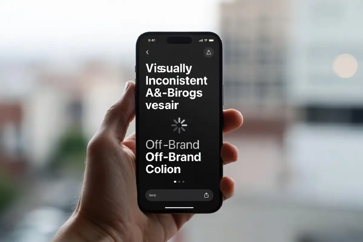
2. Inconsistent Visual Identity Across Devices
A logo that looks sharp on iOS can appear blurry on older Android hardware. Colors that render accurately in one app may look off in another. These small visual inconsistencies add up fast.
Mobile branding mistakes like these chip away at credibility. Users notice when something looks slightly wrong, even if they cannot name the problem. Their gut tells them something is off.
A consistent brand presentation can increase revenue recognition by up to 33%. That number reflects how trust is built through repetition, not just design quality.
Build a brand style guide that covers hex codes, mobile-specific font sizes, button states, and spacing rules. Then enforce it across every team and every device.
3. Slow Load Times That Destroy First Impressions
Speed is a branding issue, not just a technical one.
Most app uninstall decisions take place within the first 10 seconds, even before onboarding finishes. If your mobile experience takes more than 3 seconds to load, a large share of users leave before they even see your brand.
Over 70% of users abandon an app due to poor design, and slow loading specifically undermines trust quickly.
With Android 17 raising performance and interface expectations for users, ignoring load performance is one of the most damaging mobile branding mistakes a team can make right now.
Compress images. Reduce third-party scripts. Test on real devices, not just simulators.
4. Poor Typography and Readability on Small Screens
Fonts that work on a large monitor often fail on mobile. Small type, low contrast, and dense paragraphs are all mobile branding mistakes that damage the entire reading experience.
Your font choice communicates brand personality. A decorative typeface that becomes unreadable at 14px hurts both usability and how users perceive your brand.
The minimum recommended font size for body text on mobile is 16px. Contrast ratios should meet WCAG accessibility standards. These are not design preferences in 2026. They are baseline requirements.
Stick to two fonts maximum. One for headings, one for body text. Keep line height around 1.5 to make scanning comfortable.
5. Missing Out on On-Device Branding Opportunities
AI apps rising to the top of app store charts in 2026 means feed-based branding is more competitive than ever. But the real untapped surface is the device itself.
Most brands compete inside apps and social feeds. Few show up in the native device experience through mobile OEM placements. That gap is one of the most overlooked mobile branding mistakes this year.
According to Business of Apps, on-device branding through OEM inventory reaches roughly 1.85 billion daily active users across close to 86% of the global Android market. It sits in a brand-safe, fraud-free environment, and most brands are not using it.
If your brand only lives in paid social feeds, you are missing a significant mobile branding surface.
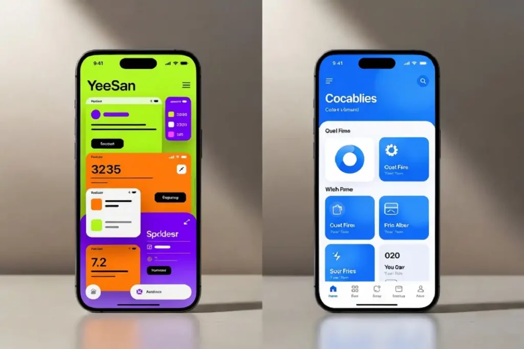
6. Cluttered Screens and Visual Overload
More is not more on mobile. Cluttered interfaces create cognitive friction that drives users away.
One of the most frequent mobile branding mistakes is stuffing too much into one screen. Finance apps displaying every metric at once. Shopping apps launching multiple pop-ups before checkout. Navigation menus stacked three levels deep.
Weak hierarchy buries critical actions like CTAs and key information, making tasks harder to complete. When users cannot scan or prioritize content quickly, sessions shorten and conversion drops.
Use progressive disclosure. Show users only what they need at each step. Reserve secondary content for taps and drill-downs.
7. Ignoring Brand Voice in Microcopy
Microcopy is the small text inside buttons, error messages, loading states, and form labels. It is easy to overlook. It is also one of the most valuable branding touchpoints on mobile.
“Submit” says nothing. “Get my free report” says something. That difference is not small.
Mobile branding mistakes in this area include robotic error messages, CTAs that fail to explain outcomes, and onboarding instructions that read like legal documents.
A call to action should clearly explain what will happen next. Users hesitate when outcomes are unclear. Using specific actions like “Create Account” or “Download Report” improves conversions significantly.
Write microcopy as if you are talking to one specific person. Review it with the same attention you give your headline copy.

8. Using AI-Generated Visuals You Cannot Own
AI image tools are widely used in 2026. Many brands use them to cut design costs.
The problem is ownership. In many jurisdictions, including the US and parts of the EU, AI-generated images cannot be trademarked. If you build your brand on an AI-generated image that you cannot own, you are building on sand.
This is one of the less obvious mobile branding mistakes, but it is increasingly costly. Using unprotectable visuals for your app icon, splash screen, or primary product imagery means a competitor can legally use the exact same assets.
Use AI tools for concepting and mood boarding. But for final brand assets, work with a human designer and secure the rights.
9. Ignoring Platform-Specific Design Conventions
iOS and Android users have ingrained expectations for how their phones should behave. iOS users expect swipe-back navigation. Android users rely on back buttons. When your app ignores these norms, the experience feels unfamiliar and off-brand.
With leadership teams now under pressure to prioritize digital experience end to end, platform-specific design is no longer just a developer concern. Ignoring these conventions is one of the mobile branding mistakes that signals a team is out of touch with how their product is actually used.
Invest in platform-specific testing. Use native UI components where possible. Let the platform handle familiarity so your brand layer can handle what makes you distinct.
How These Mobile Branding Mistakes Add Up
Mobile branding mistakes rarely destroy a brand in a single moment. They accumulate. A slightly off-brand font here, a slow loading screen there, a confusing CTA somewhere else. Each one chips away at user trust.
Most of these mobile branding mistakes come down to one core problem. The brand was not designed with the mobile user’s actual context in mind.
The brands that win on mobile in 2026 treat every screen state as a brand moment. Not just the homepage. Not just the splash screen. Every tap, every error message, every loading indicator.
Final Thoughts
Fixing mobile branding mistakes does not require a full rebrand. It requires attention.
Audit your mobile experience the way a first-time user would. Look at it on three different devices. Check load times. Read every piece of microcopy out loud.
Your brand should feel consistent, fast, and clear on every mobile screen. When it does, users trust you. When it does not, they leave and do not come back.
Start with the mistake doing the most damage right now. Fix that first.